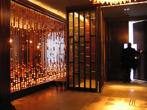
Photo by myself in the lobby of The Royalton, the swanky hotel at 43rd Street and 6th Avenue.
The downstairs bar and restaurant are dramatically lit. The interiors were originally designed by the innovative Phillipe Starck. A complete renovation was done in late 2007.
There are a few Starck-designed hotels that were hip in their day, including The Hudson at 58th Street and Columbus, and The Paramount at 46th and 8th Avenue.
You can check out the original Starck design for the Royalton, before the renovation here. It was strikingly different - modern and quirky, much less homey than it is now.
Interiors are changing all the time. I guess people need to feel like they're experiencing new things, even if they're drinking the same drinks and talking with the same people.
These days, the exterior and interior of a building are seen as separate entities. The building exterior stays more or less the same, while the interior changes depending on the tenant, or the decade, or the season.
In architecture school, we are taught to think about the inside and outside of a building at the same time. Exterior and interior were seen as bound up with one another. In architecture school, there was no such thing as an interior designer or even a client. You, the architect, did it all.
How different it is in the real world!
Related posts: On Living in a Petri Dish, It Takes a Village and Architecture, A Glorified Profession.


7 comments:
j'avoue que je ne suis pas un grand fan de Starck.
I admit that I'm not a big fan of Starck.
I rather like it when I enter a building and the interior is just so different to the exterior and how I expected it to be. I don't generally notice decor but sometimes even I am blown away by things.
wow... swanky!
Love the warm, amber tones...
I'm not a big fan of Starck either. All his designs were the same. Love the warm tones in this photo, it's much improved from what it was.
I'm keen to see what AvroKo have done with Double Crown right now as I've generally liked their other interiors.
Kitty, this is so cool! I love the lines and the amber hues! I bet it hit you with a wow!
Interesting screen, reminiscent of an abacus. Do they use it to count the money?
Post a Comment