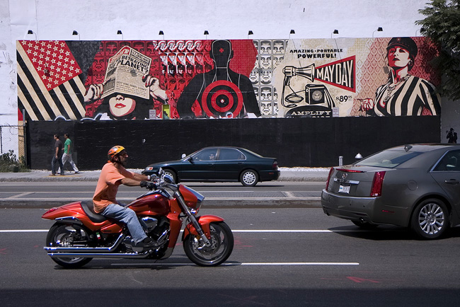
Photo by myself on Houston Street.
The boundary between SoHo and NoHo is the 'Ho' part, or Houston Street. Mhmmmm.
Shepard Fairey, the artist who created the 'Hope' poster of President Obama, has created a giant mural on the north side of Houston Street. The mural is set against a building, with lights above.
Fairey's style is heavily influenced by Soviet-era posters and Old World engravings. This 100+ foot long mural looks a lot like an ad for Target. The bulls eye is actually a reference to Jasper Johns.
This spot was taken up by a recreated mural by Keith Haring not long ago.
Fairey has huge talent, and is known for his paste-up stickers and socially-themed posters. Collectors routinely snatch up his posters on his website, only to sell them on ebay for profit.
Nice to know he's made it huge.
Related posts: In Full Color, on Houston Street, Abandoned Lot in the East Village and An Urban Art Form, Downtown.
Tuesday, August 10, 2010
On Target, On Houston
Subscribe to:
Post Comments (Atom)


12 comments:
as advertisements go this rocks! love the capture of the cool motorcycle dude!!
superbe cette création, un artiste qui a beaucoup de talent
Beautiful picture, especialy with the motorbike on it.
Hey Kitty, weirdly at the time Fairey and Deitch denied it was an ad for Target, however it was an ad for his show - the final one at the Deitch gallery before it closed - which is why it caused a kerfuffle since it was an illegal advertisement!!
Stylistically it looks a lot like a Target ad to me though, so it would be interesting if Fairey has since done an about face on his earlier denials. Have you heard it's a Target ad for sure?
Thanks Elsiee! I was lucky to be there when the bike passed.
Hi Olivier
I agree. Fairey has his detractors but he produces a ton of work and is very talented.
Thanks Joanne!
Hi Biebkriebels
A whole posse of bikes roared by. There were other maroon ones and black ones too. I'm glad this guy was on a red bike. :-)
Fish!!!!
Thanks tons for pointing out the non-advertisement nature of the mural. I was misled by the color. Target would have insisted on many more target logos, of course.
You're right, the press release states it's a social commentary piece. Since the Haring mural stood here, I suppose this is a spot relegated to art. Thanks again!
Great art! Great picture.
it is nice to hear about an artist getting recognition.
Cool shot Kitty.
Your post stirred up an old memory of when I used to see Kieth Haring riding his bike through the Village.
The red bike is great with the mural. Did they take away the Haring mural or paint over it?
Target is Walmart with better (different) marketing.
kitty, perfect compliment color on the motorcycle. So like.
geez, what a knowledgeable comment I didn't know any of that! Spot on.
They blacked out the bottom to warn off all the graffiti punks who kept ruining it...
Great street scene! Love the mural!
Post a Comment