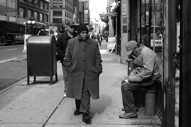
 Photo by myself, at 39th Street and Eighth Avenue in Midtown.
The weather has truly been resembling March lately. It's been slightly chilly and blustery, sending everyone running to their long coats and hats.
Also, the Megamillions sweepstakes drawing on Friday for over $550 million dollars turned up three first place winners around the country. Despite that, people are still playing the lottery. Above, the guy on right was playing one of those instant win games, where you scratch off areas to see whether you've won.
Usually I don't mess around with the proportion of an image. More often than not, I post using a 4:3 proportion, or 1200 x 900 dpi, as in the photo below:
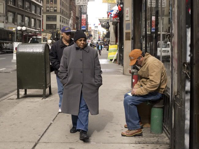 For some reason, the photo didn't look right. So I changed the cropping proportion to 3:2, or 1200 x 800 dpi. The result is more horizontal and oppressive. The overall layout seemed to reflect the body language of the
 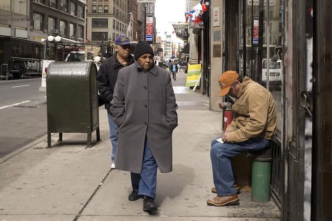 Finally, there were some nice shadows on the
What do you think? Is the flatter image better? Do you prefer the color over black and white? Is using black and white a gimmick?
Let me know. I'm curious!
Related posts: On Chrystie Street and Photography 101, On Stolen Glances and New York Moments, and Bewildered, in Times Square.



7 comments:
je préfère la dernière version en couleur. Après il est normal que plus tu réduis ta photo, plus les détails ressortent.
I like the colour one too, there is nothing wrong with cropping I think? Mostly you get a better photo with it. I thought it was a male walking in the big coat, no handbag, big step...
I thought it was a man too! I like colour for this one as there's lots of interest in the background and I always look there too, with b & w the background is lost a little.
Now that's from one who knows nothing about the technicalities of photography - just what she likes and notices.
Sorry Kitty, I'm not signed in tonight.
Thanks Olivier.
That's a good point. You do lose a lot of detail with the monochrome. hm.
Hi Bieb
oh no, I think you're right! It is a man! Yikes! haha.
Thanks Rose!
I will have to find this fellow and apologize to him profusely. haha.
I can see your point. Especially because there's no depth of field, the b/w flattens the photo and it's harder to understand.
That's a minor crop that just tidies things up a little. Nothing wrong with that.
Some images work in BW but I'm all for using it judiciously. This one works for me in colour.
I can honestly say I wouldn't want to win $200M. That could ruin your life. :-)
haha Wayne!
I have to say, my coworkers and I spent a good deal of last week seriously planning what we would do with our share of the winnings. A good many people were disappointed!
I like the black and white treatment, definitely don't think that should be looked at as gimmicky. It reflects the grittier side of street photography better, I think.
Post a Comment